Tinte Mobile App
Timeline
April – December 2020
Context
CareerFoundry UX Immersion Course
My Responsibilities
User Research
Wireframing/Prototypinh
UI Design
Content Strategy
Overview
At CareerFoundry, I was tasked to design an app for tattoos - a subject I was initially intimidated by because I knew nothing about getting tattoos. Based on tattoo statistics in the US, I learned that 76% of 18-40 year olds have at least one tattoo - 32% of people claim they’re addicted to ink, 17% at least partially regret their tattoo, but why? As a designer who loves to explore emotion and visual communication, I knew that creating a tattoo app would be a fantastic opportunity to design a solution that would help empower and improve these people’s permanent decisions of self-expression.
Product Goals
To design an application that guides users through their journey of getting inked, and ultimately empower self-expression, while reducing regret.
Research
Competitive Analysis
I conducted market research on Inkhunter and Tattoodo - the top two competitors. I performed a full SWOT analysis for each, which gave me insights on the industry landscape and on what my app could bring that was unique and different.
From the market research and competitive analysis, I created an BRD including an Executive Summary, S.M.A.R.T Business Objectives, Scope, functional requirements, and a weekly delivery schedule.
User Interviews
I conducted quantitative and qualitative user research by setting up an online survey, as well as 3 remote user interviews to better understand their experiences with getting a tattoo, and help narrow down what pain points the app should address. I noticed three main trends:
People mainly use Pinterest and Instagram as inspiration for tattoo designs.
Tattoo artists & salons need to be legitimate and trusted.
People would like to try on tattoos virtually before committing.
Based on the three main key findings and insights gleaned from the research, I created three features that the app would incorporate: the ability to explore design inspirations, find appropriate artists who fit their criteria, and use augmented reality to “try on” tattoos before committing.
Closed Card Sorting
In addition to the 3 user flows from the user personas, I refined the information architecture with a closed card sorting session online. The revised sitemap (on the right) shows a more coherent and fluid flowchart that would provide a better user experience.
Wireframes
I started designing with a low-fidelity sketch to mid- and high-fidelity wireframes for the 3 main features for the app. My focus was to design screens that presented information in an intuitive, familiar manner and wouldn’t confuse or overwhelm users.
Explore Feed
Finding Artists
Collection
Usability Testing
Finally, it was time to put the first prototype to test. I conducted six remote moderated tests to determine users’ learnability of the app upon their first interaction with it and evaluate the usefulness of the app. I paid extra close attention when users performed any errors or expressed confusion, and used Jakob Nielsen’s 4-step severity rating scale to rate the seriousness of each problem. Participants were given a series of scenarios and tasks to complete to see if they could successfully:
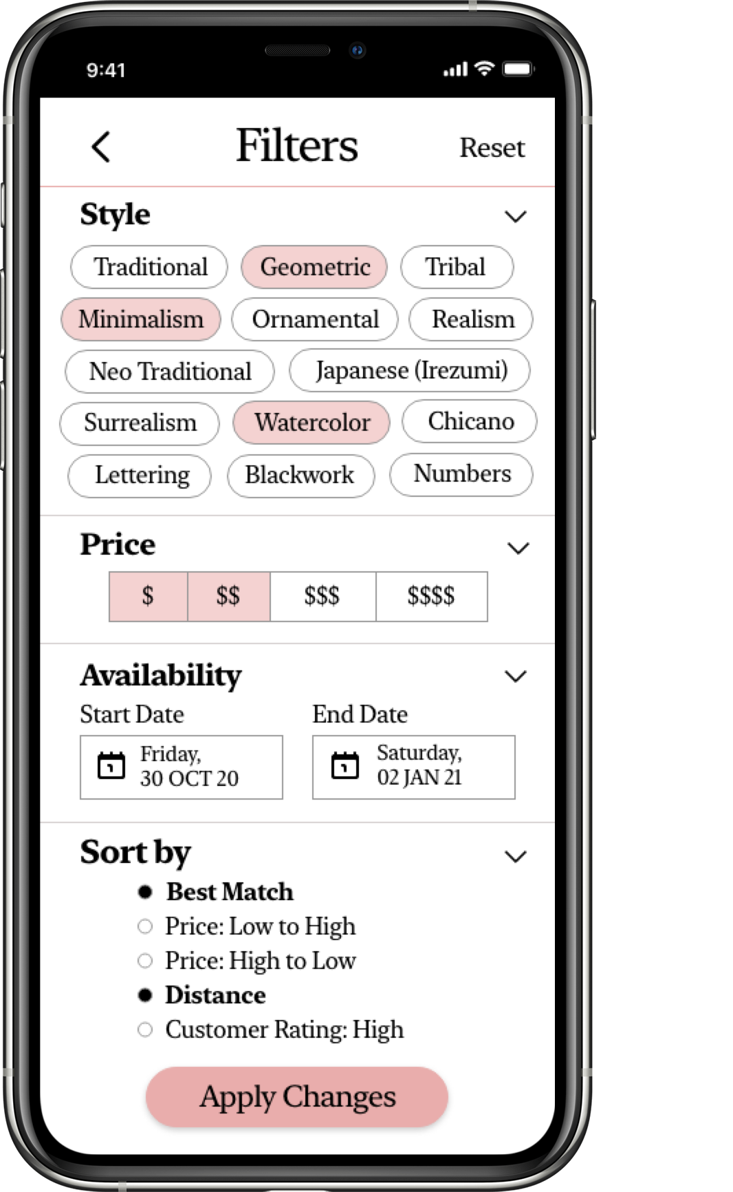
Search and filter tattoo designs by style
Save their designs successfully
Look up an inventory of tattoo artists
Connect Tinte to GoogleMaps to see where artists and studios are located
Use the AR feature to virtually apply tattoos
While I updated all the screens, these were the three highest priority issues that I initially focused on, which were on the Explore/home screen:
The Explore page did not communicate clearly that it was a feed of design inspiration.
The function of the filter icon was not intuitive for users and its random position on the top-right corner felt awkward.
Searching for a tattoo felt confusing because there were too many categories to choose from.
First Iteration
In general, the improvements I made were based on the premise of presenting information in an intuitive, concise way. The Explore page is the first screen users land on, so I focused on making it more user-friendly (highlighted below).
Final Designs - an Interactive Prototype
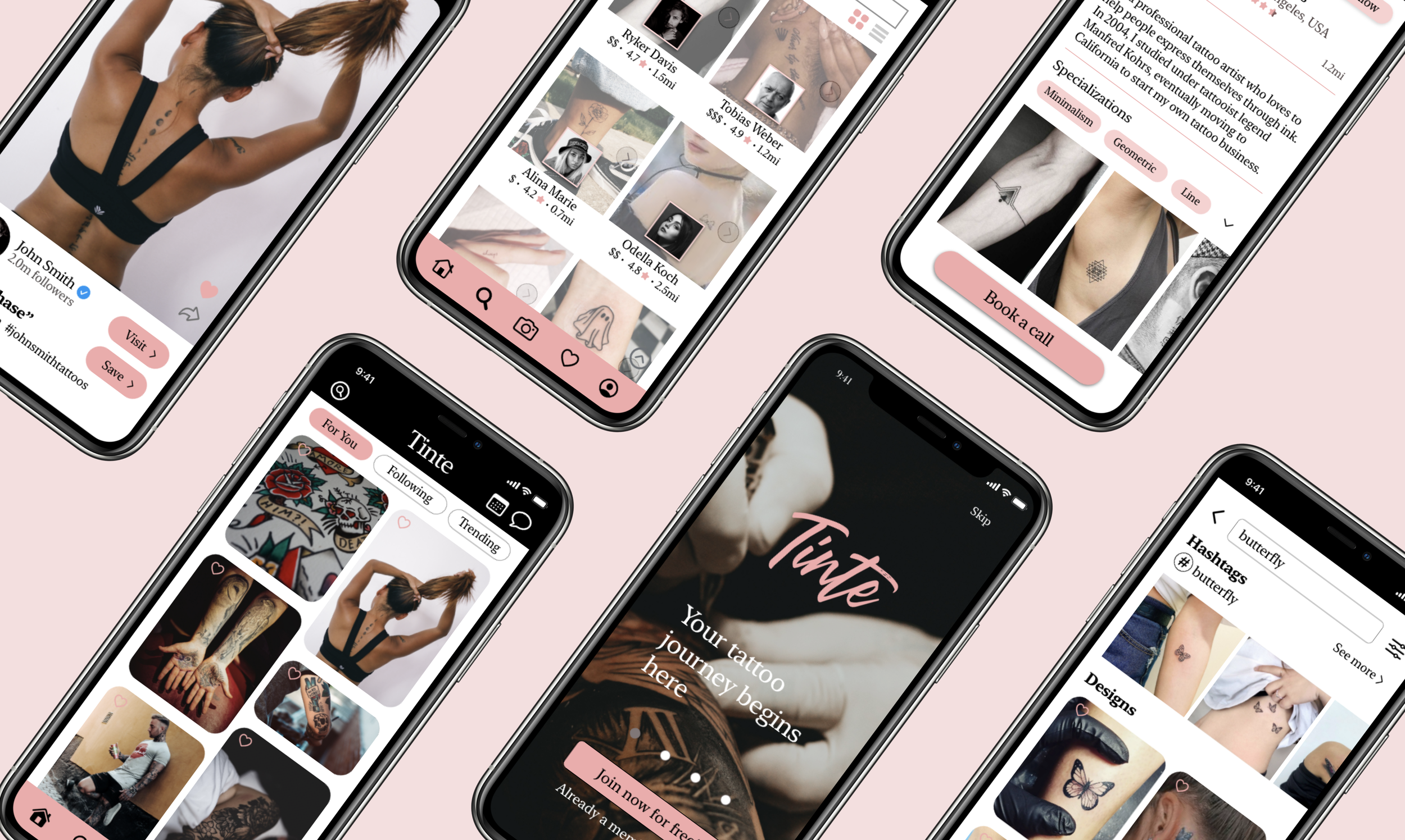
The final prototype was created to address the three main insights discussed earlier. Its core features include a page for design inspirations, a searchable catalog of artists and studios, and a camera that supports virtual tattoos. Addition features include a collection page for saved items, and social media for the tattoo community. Below is a closer look at how the app works, and how its features and functionalities attempt to solve the key findings. To view the entire prototype on Adobe XD, please click here.
A gallery of design inspiration
Users can explore a plethora of tattoo designs and search for styles that they like. The algorithm will take note of what users are liking and saving, and tailor photos to their preferences.
Virtual experience with Augmented Reality
Now, users can test out however many tattoos as they want, at the comfort of their homes. This augmented reality feature reduces the chances of regret. Users can also upload designs from their phones, or create their own if they’re feeling bold.
A list of trusted and credible ink artists
Artists can create their own profile showcasing their credentials, experience, portfolio, and testimonials. Users can also book a consultation call with artists directly for a more personable, authentic experience.
A place to save and share ideas
Not only can users save their ideas into categorized albums, but they can also share their inspiration with others. The app offers social networking services where people can follow each other and support each other in the tattoo community.


Learnings
What users say is subjective. While I conducted interviews for users personas and performed usability testing, I noticed I had to use my best judgment to decide how helpful users’ commentaries were in regards to what direction my app would take on and what features should stay or go. With qualitative research comes subjectiveness and although decisions are made centered around the user, not everything said should be taken literally.
Ask for feedback early on. When I began designing the high-fidelity prototypes, I went through a huge learning curve trying to figure out how to use different softwares to implement my user interface and experience designs. I spent a long time perfecting my first round of designs, only to find myself making a ton of revisions after asking for peer feedback that could have been avoided had I asked for feedback earlier.
Make sure developers are on-board from the very beginning. Although this project was not intended for launch, I have recognized the importance of involving developers early on so that everyone is on the same page. I realized that while I may have a lot of design ideas and concepts, I also need to make sure they can ultimately be translated to code and executed as an interactive product.
What’s Next?
😃 I will conduct multiple rounds of usability testing with a higher number of participants, and run A/B tests to serve a wider demographic and increase usability.
😊 I will implement AR programs such as Spark AR Studio to create augmented reality experiences for users to try on tattoos.
🤠 I also plan to further develop other important non-social media elements of the app, such as booking appointments and video-calling with artists, so the app is more well-rounded.
🤓 I will continue to seek constructive feedback from peers and other designers, as well as listen to any ideas and suggestions with open ears.


